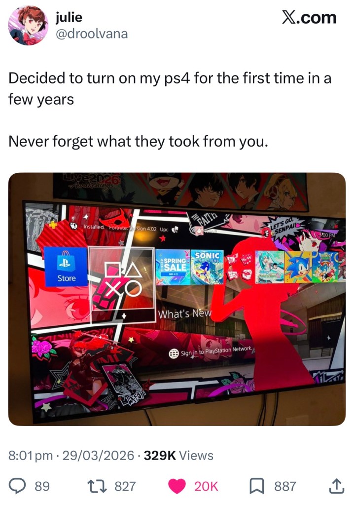
“Never forget what they took from you.”
This may seem a bit dramatic on a photo of someone’s PS4 menu, but it did make me stop and pause for a minute. I’ve not played my PS4 console for nearly 2 years, as I replaced it with a PS5 purely to play Baldur’s Gate 3 and try out newer titles. I had forgotten what my PS4 menu looked like.
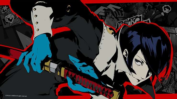
My PlayStation 4 had a dynamic theme of one of my favourite characters, Yusuke from Persona 5, which had a scrolling background and played menu sound effects from the game when I selected things, and to this day I still use the Victor Frankenstein from Code: Realize icon across my PlayStation account. These icons are now completely unavailable to buy, and you can’t even get dynamic themes on the PS5 anymore. Why?
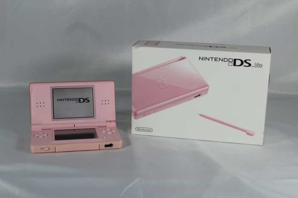
My love for customisation extends far beyond characters within games. My DSi, which I got in 2010, is coated in Y2K puffy stickers and had slideshows of my favourite photos on the homescreen. My PS4 was covered in stickers I’d got from conventions and had the aforementioned Yusuke theme, blaring out a song from the Persona 5 soundtrack. My Switch has a pastel pink angel themed case and matching dock cover, and my PS5 controller has a pastel pink kitty cover to match the headphones I used to wear while playing (they broke pretty recently!)
My point is, my personality is plastered over my consoles from the moment I pick up a controller and switch it on. They all say so much about me and the place I was in at the time of buying it. My user journey from switching on the console to starting up a game said so much about me. I love Persona, I love anime, I love otome games. Now, I get to choose one singular photo that I like for my PS5 home screen, but I only see it when I first boot up the console. The second I start to look at a game, it changes to a full image from the game I’m about to click on, meaning it changes a lot and rapidly in a short space of time. There’s no upbeat music either, just the slightly unsettling background music reminiscent of the PS2. I get that its showing off the games in my library, but what if I didn’t enjoy that particular game? Why do I need to see a huge image of it when the tiles themselves are enough?
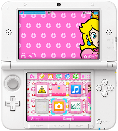
It’s not just the PlayStation 5 that’s guilty of this. The Nintendo 3DS was renowned for its plethora of UI customisation options, and users even homebrewed their own themes to create perfectly themed consoles. My DSi didn’t have this level of customisation, but it did have a sense of whimsy around it; the Flipnote frog and Voice Recorder bird moved around in their little tiles, different music played in the settings menu and the entire camera feature allowed you to take silly photos and display as many as you want on the home screen. Fast forward to the Nintendo Switch, and its as plain as can be. No music on any menu, no photos or game themes, and the most customisation you can do is setting it to dark mode or light mode. The only tiny remnant of whimsy are the sound effects on the start page and when selecting certain areas of the home screen, like your friend list or photo library.
I miss the fun in console UIs. Gaming is not meant to be a smooth, clinical experience; I’m here to play games! To have fun! I don’t find modern UI in consoles to be very exciting or enticing. I hope in the future we can see a balance between modern tech and the whimsical joy weaved throughout the experience.


Leave a comment